Panels tutorial: Difference between revisions
| Line 71: | Line 71: | ||
Additionally, when the “Overlay” property is used it is most commonly done with panels with a geographical location. This property indicates which overlay should automatically be made active when the end-user opens the panel. This is relevant when the panels displays information which summarizes or highlights specific data which is calculated or made visible by an overlay. | Additionally, when the “Overlay” property is used it is most commonly done with panels with a geographical location. This property indicates which overlay should automatically be made active when the end-user opens the panel. This is relevant when the panels displays information which summarizes or highlights specific data which is calculated or made visible by an overlay. | ||
<div style='display:none;'>===Assignments test===</div> | |||
<!-- | |||
<div style='color:orange !important'> | <div style='color:orange !important'> | ||
{{header|level=3|color=orange|Assignments}} | {{header|level=3|color=orange|Assignments}} | ||
</div> | </div>--> | ||
These assignments test basic comprehension on how panels can be used to communicate to end-users. | These assignments test basic comprehension on how panels can be used to communicate to end-users. | ||
# Create a panel informing the end-user of an issue on a specific road. Make this panel a clear call-to-action for the specific stakeholder who has to resolve the problem. | # Create a panel informing the end-user of an issue on a specific road. Make this panel a clear call-to-action for the specific stakeholder who has to resolve the problem. | ||
Revision as of 14:03, 7 June 2018
Prerequisites
The following prerequisites should be met before starting this tutorial:
- This tutorial relies on base knowledge about the editor interface and the creation of excels for indicators. If you have not yet followed the tutorials related to those subjects please do so first.
- This tutorial can be followed with any project of any arbitrary location. Recommended is to create or load a project in the editor with 3 or more neighborhoods at least partially within the project area
- Microsoft Excel is required for completing this tutorial.
Preparations
Take the following steps as preparation for following this tutorial:
- Start your project. This can be a pre-existing project, or a newly created project.
- Start Microsoft Excel. Excel will be required in the later stages of the tutorial.
Introduction to panels
Panels are interface elements which can be made visible to the end-user. These panels can be made visible to the user in multiple ways, including a popup in the 3D world, giving the panel or its information a physical presence as well. There are multiple types of popups, each of which behave and are configured in the same manner, but the way the panel generates its content differs.
Types of panels
There are 5 types of panels:
| Type | Description |
|---|---|
| Text panels | Content is statically defined text, which can be formatted as html. You can configure the text. |
| Web panels | Content is a viewport in which a website is loaded. You can configure which URL to direct the viewport to. |
| Global panels | Content is a list of globals, present in the project, and input fields with which their value can be changed by the end-user. You can configure which globals to list. |
| Excel panels | Content is text, which can be formatted as html, as defined or calculated by an excel sheet. You can configure which excel sheet provides content for this panel, similar to how an indicator is defined by an excel sheet. |
| Template excel panels | Content is (indirectly) text, which can be formatted as html, similar to a “regular” Excel panel. However, the Template Excel panel is not directly accessible by an end-user. It forms a definition, based on which panels are generated which are visible to the end-user. |
In most use-cases, Template Excel panels are the most effective tool for communicating information to end-users.
Panels in the editor
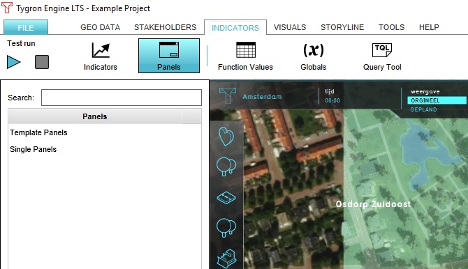
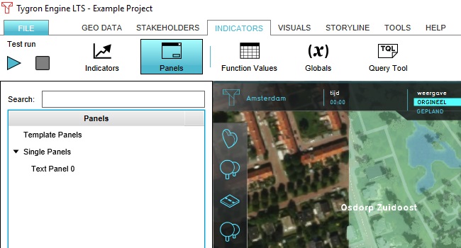
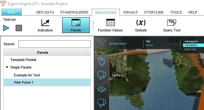
To edit panels, go to: Template:Editor ribbon When adding panels, they will be added in the categories “Template Panels” and “Single Panels”. Template Excel Panels, and their generated instances, will appear under “Template Panels”. All other panels will appear under “Single Panels”.
Adding a Text panel
To add any panel, you can either hover over “Panels” in the ribbon and select “Add … Panel”, or select the desired type at the bottom of the left panel with the “Type” dropdown, and then selecting “Add Panel”. To add a Text panel, select “Add Text Panel” via the menu in the ribbon, or select TEXT_PANEL in the left panel.
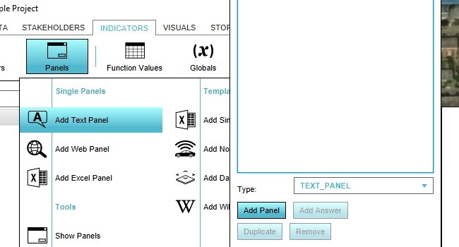
The panel will be added in the Single Panels category.
Configure the panel size and contents
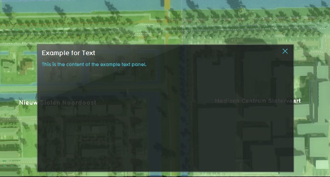
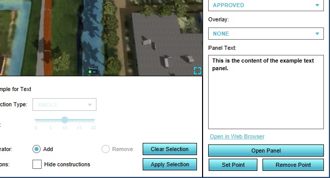
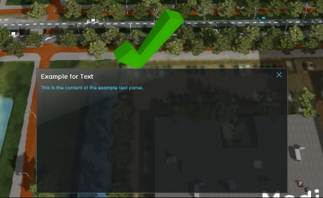
Now that we have a panel, we can configure it to display how and what we want. When you select the panel in the left panel, you can see its properties in the right panel. Change the contents of the fields “Name” and “Panel Text”, and then click on “Open Panel”.
You can continue to adjust the title and content of the panel, as well as the height and width of the panel by adjusting the “Panel Width & Height” fields. When you have done so, click “Open Panel” again to see the result of your changes.
Place panel in the world
You have now opened the panel using the “Open Panel” button in the editor. You can also place the panel as a popup in the world, which the end-user can click to open the panel. You do this by clicking on “Set Point” in the right panel, and then using the brush to select a location in the 3D world to place the popup.
When you applying your selection, you will see the popup appear with a default 3D icon. Click on it to open the panel.
Configure panel model, visibility, and attention
When the panel is added to the world, there are a few more properties to configure which determine how the popups communicate information to the end-user. Check or uncheck “Visible” to make the popup visible or invisible. When the popup is not visible, no users can see or click on the popup in the 3D world. This is commonly used to hide information which is not relevant or equivalent to a status quo. Check or uncheck “Attention” to set whether attention should be drawn to the popup. This means an arrow will appear when the popup is not within sight of the end-user, to indicate that their attention is required at the location of the popup. This is commonly used to indicate that an action is required by the end-user. Check or uncheck “Assign to Stakeholder” to make the panel visible to only a single stakeholder or to all stakeholders. When checked, the dropdown menu with stakeholders can be used to determine which stakeholder the popup belongs to. Only that stakeholder can see the popup. Change the “Model” property of the panel to change which 3D model is used to display the popup. Options include a green check, a red X, a demolition ball, an hourglass, and more. Changing this icon automatically also changes the 2D icon used in place of 3D icons when zooming out to the highest levels.
You can remove the panel from the 3D world by clicking on “Remove Point” in the 3D world.
Additionally, when the “Overlay” property is used it is most commonly done with panels with a geographical location. This property indicates which overlay should automatically be made active when the end-user opens the panel. This is relevant when the panels displays information which summarizes or highlights specific data which is calculated or made visible by an overlay.
These assignments test basic comprehension on how panels can be used to communicate to end-users.
- Create a panel informing the end-user of an issue on a specific road. Make this panel a clear call-to-action for the specific stakeholder who has to resolve the problem.
- Create panels for two or more neighborhoods with a (fictional) description of what is significant in that neighborhood (fictional landmarks, concerns of residents, etc). Make this information available to all stakeholders.
Remove the panels created in these assignments when you are done.
Add a Web panel
The next type of panel to add to the project is the Web panel. This panel can be added in the same manner as the Text panel. The panel will be added in the Single Panels category.
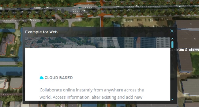
All configuration options for the Web panel are the same, except that the content of the panel is not defined by direct text, but by a URL. The URL must lead to a web page which is publicly reachable via the internet. If this is the case, then the panel will display that web page. Change the “Panel Text” property of the Web Panel to the homepage of your organization’s website, and select “Open Panel”.
