Panel: Difference between revisions
mNo edit summary |
|||
| Line 1: | Line 1: | ||
{{learned|what panels are|how panels relate to the Tygron engine|what types of panels are available to you|common use-cases which can be fulfilled using panels|how to add and edit panels in a project}} | {{learned|what panels are|how panels relate to the Tygron engine|what types of panels are available to you|common use-cases which can be fulfilled using panels|how to add and edit panels in a project}} | ||
{{stub}} | {{stub}} | ||
Revision as of 13:01, 31 July 2018
Panels
Panels, in a software context, are windows, dialogs or similar generic interface elements which are presented to a user. They can be small prompts or dialogs which facilitate an inquiry or message towards a user. They can also be larger, more complex interface components with multiple texts and/or elements on them.
Panels in the Tygron Engine?
In a project, panels are a term specifically used for a user-defined interface element, which can be created and configured in the editor. They are purposefully left generic and abstract. The contents are entirely left open for a project- or template-specific implementation. Panels can be placed in the 3D world, where they are represented by a popup which can be clicked to open the panel. They can also be opened via a client event, or left entirely unavailable.
Most panels render a html content. This means they can display text without additional formatting, but can also be styled using html, css, and javascript. This has the added benefit that those panels can also be opened in a web browser, or included in the rendering of a web interface.
Panel types
There are 5 types of panels available in the Tygron Engine.
| Panel type | Description | Functioning |
|---|---|---|
| Text panel | The contents of the panel are defined directly as text. | The text is interpreted as html content and directly displayed as content of the panel. If it's html-formatted content, it will be displayed in that styled manner. |
| Web panel | The contents of the panel are defined by a url. | The web page at that url is used as content for the panel. When attempting to open the panel in a web browser, the web page will be accessed directly (i.e. not via the Tygron Engine). |
| Global panel | One or more globals are linked to this panel, allowing an end-user to edit the values of those globals during a session. | The panel has a predefined structure in the session interface, and a fixed location. For each linked global, an input field with that global's value is displayed. The value can be changed and submitted by an end-user in the session. This will change the value of the global to the entered value. This panel does not have an html representation, and cannot be opened in the web browser or be made part of the web interface. |
| Excel panel | The contents of the panel are defined by an excel file. | Each time data in the project or session is updated, the excel file is recalculated. The results are interpreted as (html-formatted) text, and displayed as such. Effectively, this panel is similar to a text panel, but rather than a static definition for the text contents, the definition is dynamically generated via the excel. |
| Template excel panel | This is not a panel by itself, but forms a definition by which panels can be generated automatically. The "instances" of these panels behave as regular panels. | Based on how the template panel is defined, a number of "instances" of the panel will be generated. Configurations such as the size, model, and attributes of the panel are carried over directly. The panel name, the assigned stakeholder, and certain queries in the excel are modified based on what the template panel is applied on. |
Properties of panels
Panels have a number of properties which can be configured in the editor. They also allow for the definitions of arbitrary attributes.
Name
Sizing
Availability
Visualization
Overlay
Content
Attributes
Use-cases for panels
Adding and editing single panels
Adding/removing panels

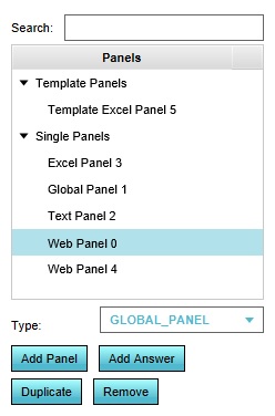
- Select the desired panel type at the bottom of the left panel.
- Select "Add Panel".
- Select the "Single Panels" category in the left panel.
- Select the specific panel you wish to remove.
- Select "Remove".
Configuring panels
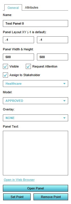
Template:Editor ribbon When you select a single panel, the right panel will be filled with the information pertaining to the panel. A number of properties can be configured.

Name

- The name of the panel. You can change this by altering the text in the "Name" field.
Panel Layout

- The location of the panel, in pixels of distance from the bottom-left corner of the screen. "-1" places the panel in the default location. You can change this by changing the value in the first input field for the horizontal location, and the second input field for the vertical location.
Panel Width & Height

- The size of the panel, in pixels. The size set is the outer edge of the panel, there is some distance between the outer edge and the edge of the content placed in the panel. You can change the size by changind the value in the first input field for the width, and the second input field for the height.
Visible

- Whether the panel's popup should be visible in the 3D world. If the panel has a location in the 3D world, and the panel is visible, a popup is present in the 3D world, clickable by the end-user. If the panel has no location in the 3D world, or is not set to be visible, the panel's popup is not visible in the 3D world.
Request Attention

- Whether the panel's popup should draw attention in the 3D world. If the panel has a location in the 3D world, and the panel is visible, and the panel draws attention, an arrow will appear for the end-user indicating where the panel is.
Assign to Specific Stakeholder

- Whether the panel is only available to one stakeholder, or to all. If the checkbox is unchecked, the panel is available to all stakeholders. If checked, only the stakeholder indicated in the dropdown can see or access the panel. Other stakeholders will not be able to see the panel in the 3D world. If another stakeholder attempts to open the panel, for example via the web interface, they will get an error message that they are not allowed to access the panel.
Model

- The model used for the panel's popup. The model consists of both a 3D model for most zoom levels, and a 2D icon for the higher zoom levels and the web interface. Change the selection in the dropdown to change the used model and icon.
Overlay

- When the panel is opened, this overlay should be activated to provide (additional) geographical information to the end-user. If set to "NONE", no overlay is used. Change the selection in the dropdown to change the used overlay.
Point in 3D World

- A panel can be given a location in the 3D world. To do so, select "Set Point", and use the brush to select a position. To remove it from the 3D world, select "Remove Point".
Open Panel

- To open the panel for testing purposes, you can select "Open Panel" to open the panel in the session interface. You can also open the panel in the web browser by selecting "Open in Web Browser".
Content
Depending on the exact type of panel, different elements may exist to configure the contents for the panel.
Text

- Enter a text in the "Panel Text" field, and that text will be set as the content of the panel. If the content is html-formatted, the content of the panel will be formatted accordingly.
Web

- Enter a url in the "Web link" field, and the indicated web page will be opened as content of the panel.
Globals

- Select the globals which should be accessible via the panel, and those globals will be added to the panel.
Excel

- Select the excel which should calculate the content for this panel.
Adding and editing template panels
Adding/removing template panels
- Select the "TEMPLATE_EXCEL_PANEL" type at the bottom of the left panel.
- Select "Add Panel".
- Select the "Template Panels" category in the left panel.
- Select the template panel from which the instance was generated.
- Select the specific panel you wish to remove.
- Select "Remove".
- Select the "Template Panels" category in the left panel. Select the template panel you wish to remove.
- Select "Remove".
Configuring and instantiating panels
Template:Editor ribbon When you select a template panel, the right panel will be filled with the information pertaining to the template panel. A number of properties can be configured. Most properties are the same as for single panels. The important differences are listed here.

Name for template panel

- The name of the panel. The name of an instance of a panel is composed of the name of the template panel, and the name of the item the template is applied on.
Stakeholder for template panel

- The stakeholder who has access to this panel. Rather than set a specific stakeholder, you can specify the type of relation the stakeholder should have with the item in question. For example, the "Use Owner" checkbox indicates that whoever owns an item at the time that the template panel is applied, is set to be the stakeholder with access to the panel.
- The "Relational Filter" will make instances of panels appear only if the configured stakeholder has the indicated relation with the item the template panel is applied on. For example, if the filter is set to "Net Owner", and a stakeholder is set for the panel, there will only be instances of this template panel generated for those items of which the stakeholder is the net owner.
Template

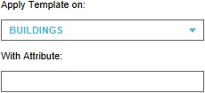
- "Apply Template on" indicates what kind of item the template should be applied to. "With Attribute" allows a filtering on what items to apply the template panel to. If set, it will only be the items of the specified kind, with this specified attribute set to a non-zero value, for which panels will be created.
Not viewable
- Note that there are no options to directly test what this panel will look like. This is because the template panel is merely a definition of how the actual instances should be structured, but which by itself is not an actual instance.
Applying

- When the template panel is configured correctly, it can be used to create the actual panel instances which appear in the project. Select "Apply Template" to create the panel instances. You will be prompted with a message indicating how many panels will be created, which you can verify before creating the panel instances.
Editing panel instances
After applying a template panel, so that one or more panel instances are created based on the template panel, it is possible to edit them as though they were single panels. However, this practice is discouraged, because it is a common possibility that after applying the template, the template should be tweaked slightly to improve it and the instanced panels derived from it. After re-applying the template, any alterations made to specific instances of the panels are lost, as the instances are created anew. Instead, it is recommended to tag the items the panels are applied on using attributes, and including in the template panel itself some logic to handle the situations where that attribute is or isn't present.
