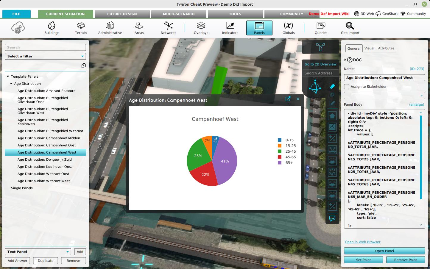
How to plot neighborhood demographics in a pie chart

A simple Template Text Panel can be created that obtains attributes directly from a Neighborhood. See below for the final panel content. The Template panel can be applied to create instances for each Neighborhood.
How to plot neighborhood demographics in a pie chart:
- Select Current Situation in the ribbon bar.
- Add a Text Template panel by hovering over panels and selecting Add Text Template.
- Select the Template tab and verify that the template is applied on Neighborhoods
- Select the General tab and click on the enlarge button to edit the text content of the panel.
- Click on the Insert TQL Plotly Graph link
- In the Overlay Selection Panel, simply click Select without selecting an Overlay.
- Next, under script, write the following line:
let trace = {values:[], labels:[], type:'pie', sort:false} - Next, place the cursor inside the values array and click on the Insert Attribute link.
- In the attribute selection panel for the Neighborhood, select the attribute named PERCENTAGE_PERSONEN0_TOT15_JAAR.
- Add a comma behind the attribute statement, and repeat for the other attributes.
- Secondly, provide label names by adjusting the label array to
labels: [ '0-15' , '15-25', '25-45', '45-65' , '65+']
- Finally, place the trace object in the data array:
var data = [trace];
- Close the text editor panel
- Click on the apply template button in the Template Text Detail panel.
- Click on the Calculation cloud icon in the ribbon bar to calculate the contents.
- Once calculated, unfold the template panel in the Panel Overview panel and select any of the child panels.
- In the Panel Detail Panel, click on the open panel to inspect its content.
Template panel content
<div id='myDiv' style='position: absolute; top: 0; bottom: 0; left: 0; right: 0'/>
<script>
let trace = {
    values: [
 $ATTRIBUTE_PERCENTAGE_PERSONEN0_TOT15_JAAR,
 $ATTRIBUTE_PERCENTAGE_PERSONEN15_TOT25_JAAR,
 $ATTRIBUTE_PERCENTAGE_PERSONEN25_TOT45_JAAR,
 $ATTRIBUTE_PERCENTAGE_PERSONEN45_TOT65_JAAR,
 $ATTRIBUTE_PERCENTAGE_PERSONEN65_JAAR_EN_OUDER
],
    labels: [ '0-15' , '15-25', '25-45', '45-65' , '65+'],
    type: 'pie',
    sort: false

};

var data = [trace];
var layout = { title: {text: '$NAME'} };
Plotly.newPlot('myDiv', data, layout);
</script>
Notes
- The panel instances are automatically placed in the 3D Visualization and can be opened by click on their respective pop-ups.