How to insert a Plotly Graph
This How-to contains the steps on how to create a Template Text Panel, containing a Line chart of a particular Grid Overlay, with calculated Area averages per timeframe using TQL. Plotly will be used to calculate the Line chart in javascript.
How to insert a Plotly Graph:
- Open a project in the Editor with the Grid Overlay and Areas that can be identified by an attribute.
- Hover over Panels in the ribbon bar and under Template Panels select Add Text Template.
- With the Template Text Panel selected.
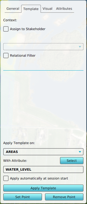
- First select the Template tab and under Apply template on, select AREAS.
- Optionally click on the Select button and select the identifier attribute.
- Select the general tab.
- Click on the enlarge button to open the text edit panel.
- Click on the link named Insert TQL Plotly Graph.
- Select the Grid Overlay you want to measure.
- With the panel text content generated, click on close.
- Click on the apply template button to create the child panels, one per Area
- Hover over the Calculation panel in the ribbon bar and select Reset Excel X-Queries
-
 Example content of a Template Text Panel
 -
-
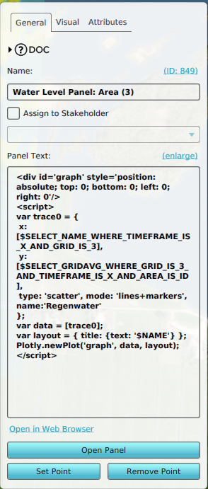
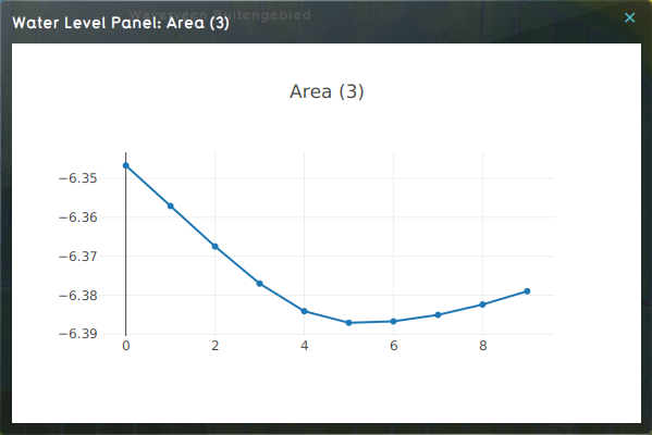 Panel content of a Water Level Area named Area (3).


