Indicator panel: Difference between revisions
No edit summary |
No edit summary |
||
| Line 1: | Line 1: | ||
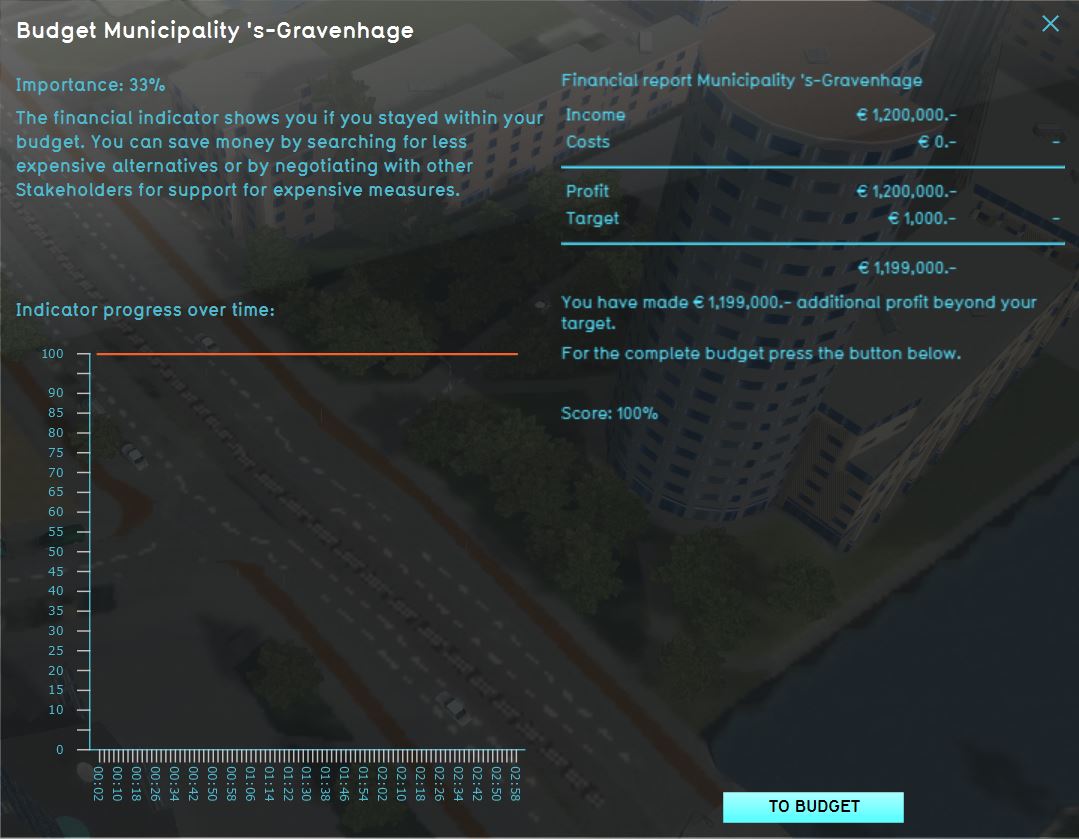
[[File:Interface_game_indicator_panel.jpg|250px|right|The indicator panel. the left side displays the name, importance, and description of the indicator, as well as the targets and the progress on the indicator. The right side displays the progress on this indicator over time.]] | [[File:Interface_game_indicator_panel.jpg|250px|right|The indicator panel. the left side displays the name, importance, and description of the indicator, as well as the targets and the progress on the indicator. The right side displays the progress on this indicator over time.]] | ||
When you click on an [[indicator]] in the [[top bar]], the indicator panel is opened, displaying the information of that indicator. On the left side, at the top of the panel, is the name of the indicator. A description of the indicator follows, providing contextual information to the user on what the indicator represents, why it is important to the stakeholder and how to improve its score. | When you click on an [[indicator]] in the [[top bar]], the indicator panel is opened, displaying the information of that indicator. On the left side, at the top of the panel, is the name of the indicator. A description of the indicator follows, providing contextual information to the user on what the indicator represents, why it is important to the [[stakeholder]] and how to improve its score. | ||
Under the "Explanation" heading, an overview displays the current score of the indicator, the target of the indicator, and the amount of progress which still needs to be made to score 100% on the indicator. | Under the "Explanation" heading, an overview displays the current score of the indicator, the target of the indicator, and the amount of progress which still needs to be made to score 100% on the indicator. Since both the description and the explanation can be provided as html, you are free to define your own layout of this information. | ||
On the right side of the panel, two graphs are visible. The top graph displays the total score on the indicator over time. The bottom graph displays the sub scores for the indicator over time. For example, in the case of the parking indicator, the bottom graph shows the amount of parking spaces per zone. | On the right side of the panel, two graphs are visible. The top graph displays the total score on the indicator over time. The bottom graph displays the sub scores for the indicator over time. For example, in the case of the parking indicator, the bottom graph shows the amount of parking spaces per zone. | ||
{{viewer nav}} | {{viewer nav}} | ||
Revision as of 16:51, 9 January 2024

When you click on an indicator in the top bar, the indicator panel is opened, displaying the information of that indicator. On the left side, at the top of the panel, is the name of the indicator. A description of the indicator follows, providing contextual information to the user on what the indicator represents, why it is important to the stakeholder and how to improve its score.
Under the "Explanation" heading, an overview displays the current score of the indicator, the target of the indicator, and the amount of progress which still needs to be made to score 100% on the indicator. Since both the description and the explanation can be provided as html, you are free to define your own layout of this information.
On the right side of the panel, two graphs are visible. The top graph displays the total score on the indicator over time. The bottom graph displays the sub scores for the indicator over time. For example, in the case of the parking indicator, the bottom graph shows the amount of parking spaces per zone.