UNESCO Heat Module

This module generates a simple heat stress overlay which visualizes the Relative Physiological equivalent temperature result type. It uses a different (and smaller) set of formula's to calculate Heat differences than the DPRA Heat Module. It does not calculate the expected Physiological Equivalent Temperature.
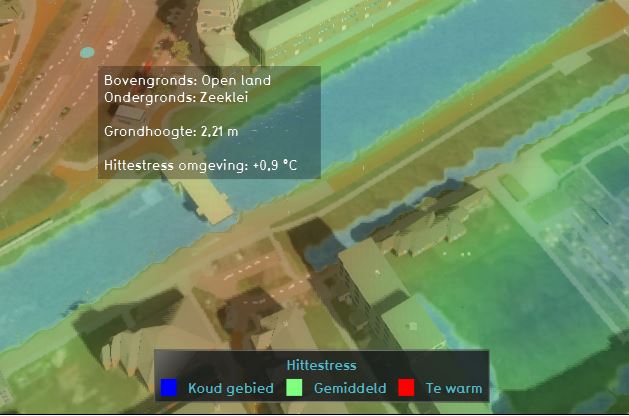
The Heat Stress Overlay is an overlay which displays the average temperature deviation (positive or negative) in different colors for the project area, indicating transitions in temperatures, resulting in Heat stress.
Legend
The default colors of the overlay generally mean the following:
- Red: Red indicates the hottest area's, compared to the surroundings.
- Green: Green indicates not much deviation from the average temperature deviation.
- Blue: Blue indicates the coolest area's, compared to the surroundings.
It is possible to change the colors of the overlay by editing the Legend in the Legend tab of the overlay.
Additional information displayed in hover panel

The hover panel gives additional information when clicking in the map when the overlay is active. The additional information includes the terrain types, height and the average temperature deviation on the clicked location in °C.
Calculations

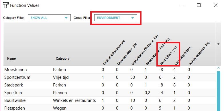
The calculation model behind the Heat stress overlay is from UNESCO-IHE. More information, including the used formulas can be found in the following document: [1]. In the function values table, each function has a Heat Effect in °C. on the surrounding areas. This Heat Effect is used to calculate the Heat stress. The default values are taken from the above document. The values can also be changed by the user.
The Heat stress overlay is linked to the Heat risk indicator.
How-to's